Today we are launching an update of our site to version 3.6.

Changes in version 3.6.
The main change of site version 3.6 is new version of Hearthstone cards rating:
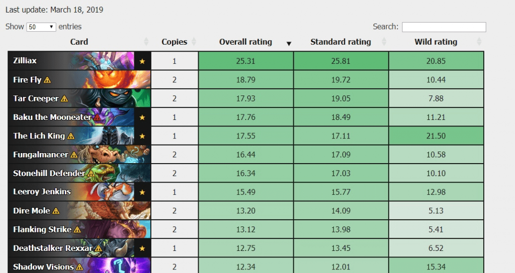
- Rating now features card tiles, so you do not have to leave page to try to remember what some card is only by that card name.
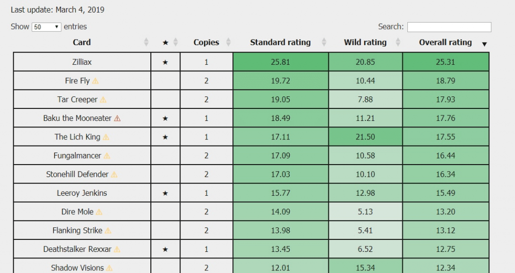
- In order to have better UX on mobile we had removed separate column with card “Legendary” status. We have also swap order of rating columns to make more important values closer to initial viewport and card names.
- We have added list of available commands, which you can use to search for cards. This list is located under the rating table. Check it and search for cards like a Pro!
- Cards data have been also updated to the current state of the meta.
Just look at how awesome it has become:


We had implemented under the hood improvements to improve development process. New updates should become easier and faster to implement and they should contain less errors than before.
We had improved our “Share” buttons. Now “Share” buttons change their color from black to primary color of corresponding social network on hover. This create better UX and we hope that it will also tend users to use the more often ?.
Information about the company have been updated: link to the company’s Twitch account have been added. Subscribe to us to not miss streams from our employees! You can also check full list of our social networks accounts at “About us” page.
As always we have fixed some bugs, mistakes and typos. In particular we have fixed broken layout on the language choice popup in the News section and have unified fonts on the News section and all other website.
You can tell us your opinion about new site version or about the bugs you have found in the comments or via email:[email protected].